“Material design” looks into the fundamentals of good design within technology. This looks at things such as Environment, Layout, Navigation, Colour, Typography, Sound and so much more.
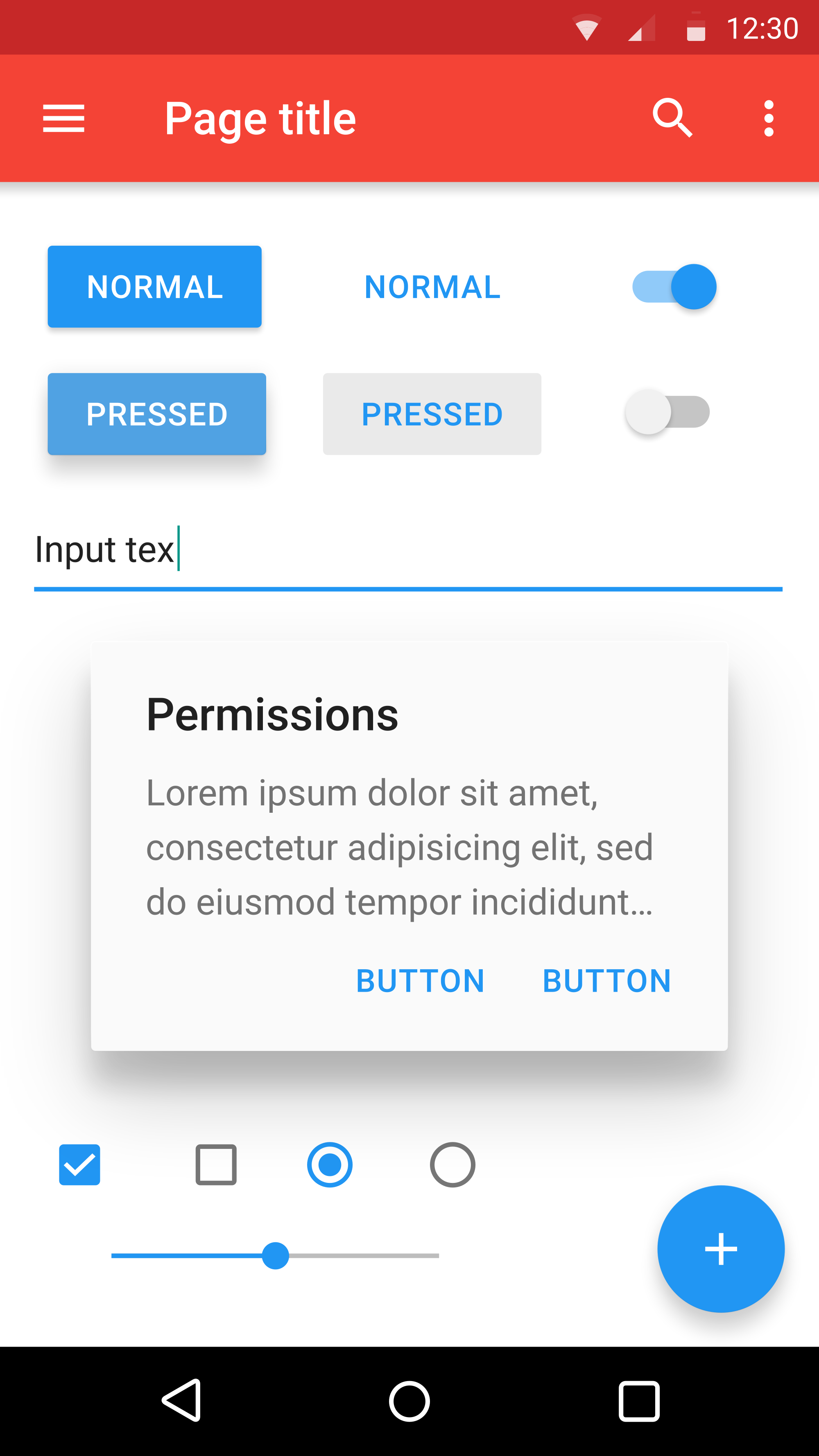
The image below is an example of good design for an app, with its simplistic and readable layout and bold colour choice.
Layout:
According to Material.io, your layout should be Predictable, consistent and responsive.
This means your layout should be organized in a way the user can quickly locate icons, typography and other feature on the page. Your layout should stay the same as to not confuse the user, if you suddenly change the layout on one page it wouldn’t make sense. Also you layout should react to the user’s interactions, icons should move or change in some way to say “Hey, you can click on me and I’ll do something!”
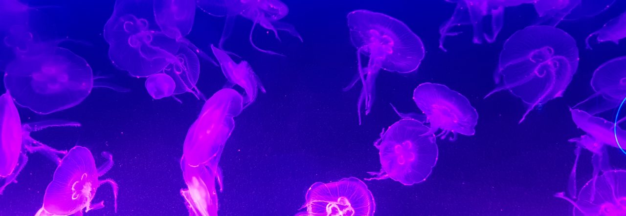
Colour:
According to Material.io, your colour choice should be hierarchical, Legible and Expressive.
This means your colours should show some individuality such as how hyperlinks can be blue while the regular text is black, it makes the hyperlinks stand out amongst the rest of the text. Legibility is very important. If you can’t or struggle to read text on a background, what’s the point of the user reading further in. Colour combinations depending on it’s complimentary or saturation can make icons or text stand out in a pleasant way. As for expressive, you want your website or work to give a welcoming or friendly vibe, to intrigue the user into reading more. But also make sense to the topic of the design, like blue instead of red for design about the ocean.
Typography:
According to Material.io, typography is a little more in-depth. Look at the heights, weight, spacing and display of typography.
A lot of this part depends on the typography be readable and expression. what’s the point of having text is the user struggles to read it because it is small, too compacted or the font is unreadable. Also, you want your font to be appropriate for the topic it is written for, more simple fonts for more customer-made display or more professional fonts for businesses.
Shape:
According to Material.io, your choice of shapes should be clear and concise.
The pointed corners of a shape should be treated similarly to an arrow point in a specific direction. The round corner gives off a friendly expression and helps enclose information from mixing with the rest. Colour Hierarchy is to be included in the shapes to make a clear design.
 Hollie Hurwood's Game Design course work